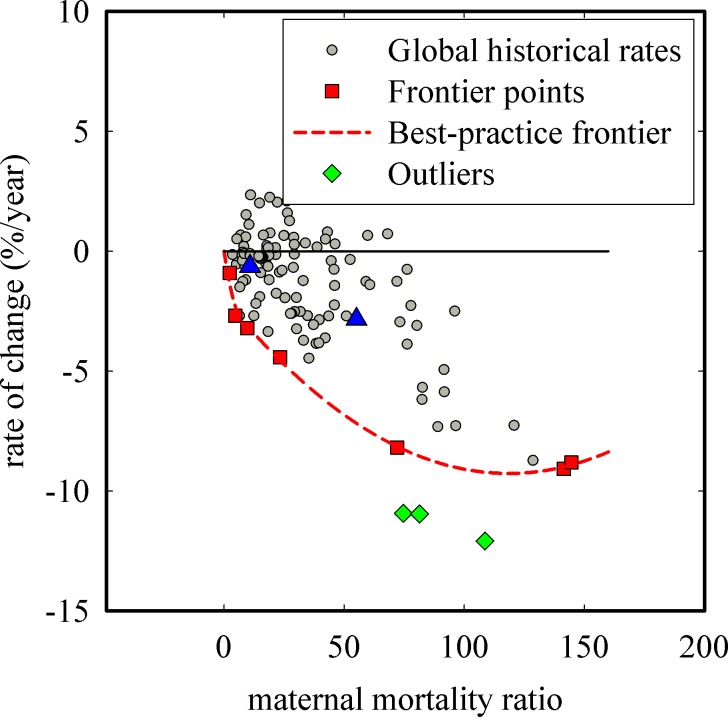
Fig 5. Construction of the best-practice frontier and calculation of performance indices for maternal mortality ratio.
Global historical rates calculated from available data are shown as circles, frontier points are shown as squares, the best-practice frontier is given by the dotted line, and the line of no progress is given by the solid horizontal line. Three outliers (diamonds) were identified through FEAR. Points A and B (triangles) correspond to two example rates of change with the associated performance index given as numerical values next to the triangles.

