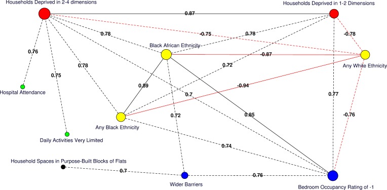
Fig 4. Correlation network of area-level significant predictors of MRSA infection or colonisation in catchment areas of the London hospital cohort.
Moderate positive PCCs are shown by black dashed edges (≥0.70 and ≤0.80) and strong PCCs by continuous black edges (>0.80). Moderate negative PCCs are shown by red dashed edges (≥−0.80 and ≤−0.70) and strong negative PCCs by continuous red edges (<−0.80). The size of vertices reflects the number of variables correlated with that vertex. Vertex colours represent variable indicators of health (green), deprivation (red), ethnicity (yellow), wider barriers and household overcrowding (blue), and household spaces by dwelling type (black). Areas with more households deprived in any dimension are those where more persons of black or black African ethnicity reside and those with greater percentages of overcrowded households. The later also correspond to those where more household spaces are located in purpose-built blocks of flats or tenements and to those with worse wider barriers scores. Negative PCCs show that persons of white ethnicity tend to reside outside the boundaries of the deprived areas where usual residents of black or black African ethnicity predominate. More residents from deprived areas self-report having daily activities very limited because of poor health, have attended a London accident and emergency hospital department, or have been admitted to hospital as inpatients around the time of the study. The greatest number of moderate to strong correlations are for the percentage of households deprived in 2–4 dimensions (n = 7), bedroom occupancy rating of –1 (n = 6), and black African ethnicity (n = 6). Maps for predictor variables of HA-, CA-, and any MRSA are shown in Fig 5.

