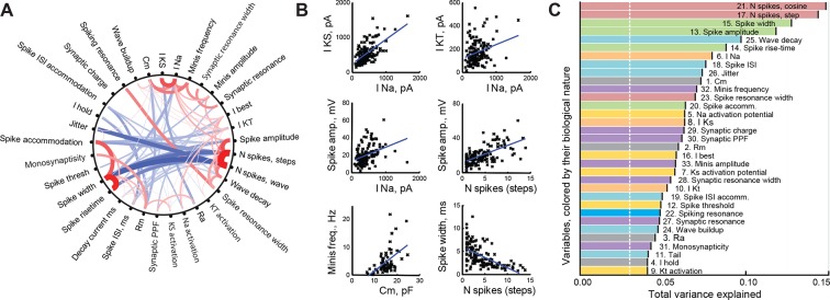
Figure 2. Correlations between cell properties.
(A) Diagram illustrating significant correlations and their strengths (r-values) for all pairs of cell properties measured. Positive correlations are shown in red; negative correlations in blue; the width and darkness of each line are proportional to respective r-value. (B) Selected significant correlations between cell variables. (C) Variables sorted by the total variance each of them can explain in the full dataset (amounts are not additive and do not add up to 100%). Colors indicate the biological nature of each variable (red for spiking, green for spike shape, blue for spike timing, orange for ionic currents, yellow for activation potentials, gray for passive properties, and purple for synaptic properties). The white dashed line shows the expected variance explained for an ideally uncorrelated variable.

