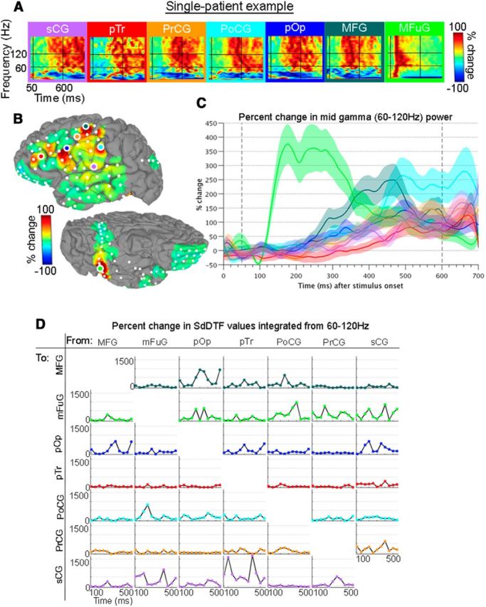
Figure 2.

Single-patient example for trials aligned to stimulus onset. A, Spectrograms show the full spectrum (0–200 Hz, linear frequency axis) of percentage change of power during the 0–1000 ms poststimulus period versus baseline for seven representative electrodes. Horizontal black bars represent 60 and 120 Hz. Vertical bars represent 50 and 600 ms. B, Upon averaging across the broadband gamma frequencies (encompassed within the horizontal black lines), and from 50 to 600 ms (enclosed in the vertical black lines), individual surface-based representations are obtained. The views are of the left hemisphere, with the lateral surface at top and ventral surface at bottom. Spectrograms (A) and surface representation (B) are on a scale from −100% to 100%. C, BGA time traces of the percentage changes from prestimulus baseline are shown with each region as an individual trace. D, Percentage changes of information flows (IFs; vs baseline) were determined for the analysis windows. Horizontal axis labels are the first point of each 100 ms window. The plot in the ith row, jth column represents IFs from the jth region to the ith region. No statistical corrections were performed for this illustrative example.
