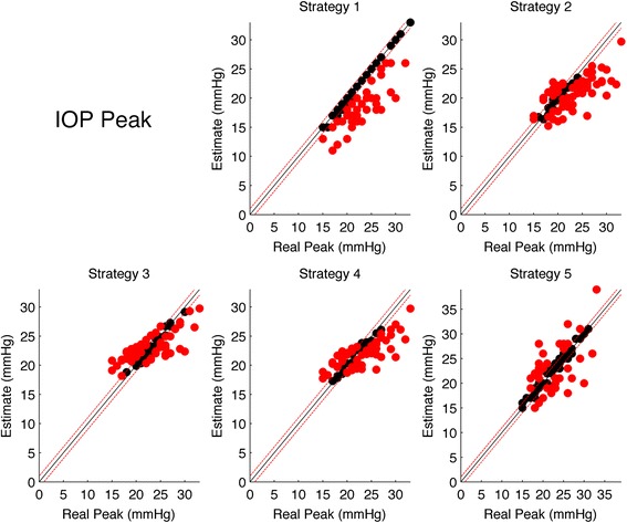
Fig. 4.

Scatter plots of the estimated IOP Peak for each stratgy versus the real IOP Peak. The black line represents the the ideal line of correct predictions, i.e. estimates exactly equal to the real value. Dashed red lines represents the range of clinical tolerance (±2 mmHg). Black dots represent the “Hits”, while red dots represent the “Misses”
