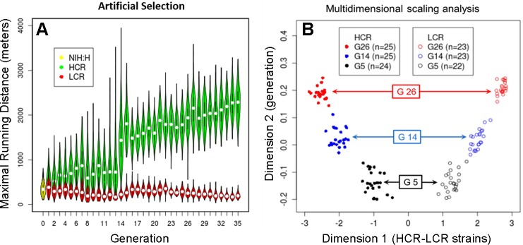
Fig. 1.
A: selection for intrinsic running capacity. A violin plot for individual generations for females and males combined. The yellow oval to the left denotes the founder population (NIH:H, n = 153 phenotyped), while green and red ovals are for highest-capacity runners (HCR) and lowest-capacity runners (LCR) over 35 generations of selection. Each of the 71 “violins” conveys the density (via width) of the distribution for maximal distance run for each generation. The white dots indicate the median values, and the black vertical lines extending from the dots represent the range of the data that is within 1.5 times the interquartile range. A violin plot is essentially a box plot to which a rotated kernel density plot is added to each side of the box. B: progressive genetic differentiation revealed by 10K single nucleotide polymorphism genotyping data. A multidimensional scaling (MDS) plot (dimension 1 vs. 2) for 142 genotyped animals in 2 lines (LCR and HCR) and 3 generations, as indicated by different symbols. While the MDS plot is generated in an unsupervised fashion from the 142-by-142 pairwise distance matrix, dimension 1 reflects the HCR/LCR difference, and dimension 2 reflects the difference between generations. These patterns show that the 2 lines formed separate clusters at generation 5 (G5), and diverged further in G14 and G26. [B from Ren et al. (77) as permitted by PLoS One].

