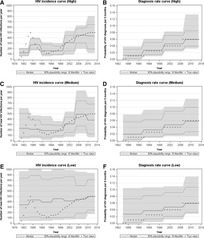
FIGURE 6.

The resulting incidence curves and diagnosis rate curves as determined using our calibration method to the (A) and (B) high, (C) and (D) medium, and (E) and (F) low data availability scenario, respectively, with the “true” values as in the hypothetical epidemic represented by diamonds.
