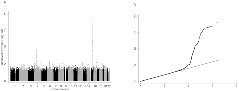
Figure 1. Manhattan and quantile-quantile plots illustrating genome-wide meta-analysis results.
Manhattan plot (A): All SNPs plotted on x-axis according to their position on each chromosome, against their association with cotinine level, as shown on the y-axis as –log10 p-value. QQ plot (B): The observed distribution of p-values (y-axis) against the expected distribution of p-values under the null hypothesis (x-axis). Plots includes variants which were genotyped or imputed in at least 3,000 individuals only (~7 M SNPs).

