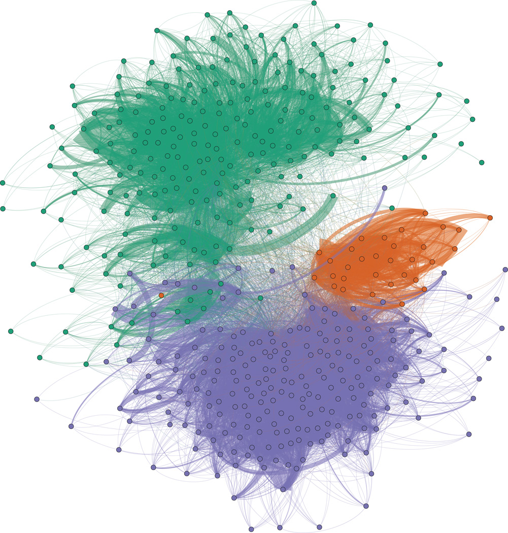
Figure 1.
Map of hospitals (dots) and transfers (dark lines) in a force layout projection of the CA data. 3 major clusters in the CA network, colored separately (San Diego in orange, LA in purple and San Francisco and Northern CA in green) , were detected using network modularity clustering. This graph shows how tightly connected hospitals in CA are.

