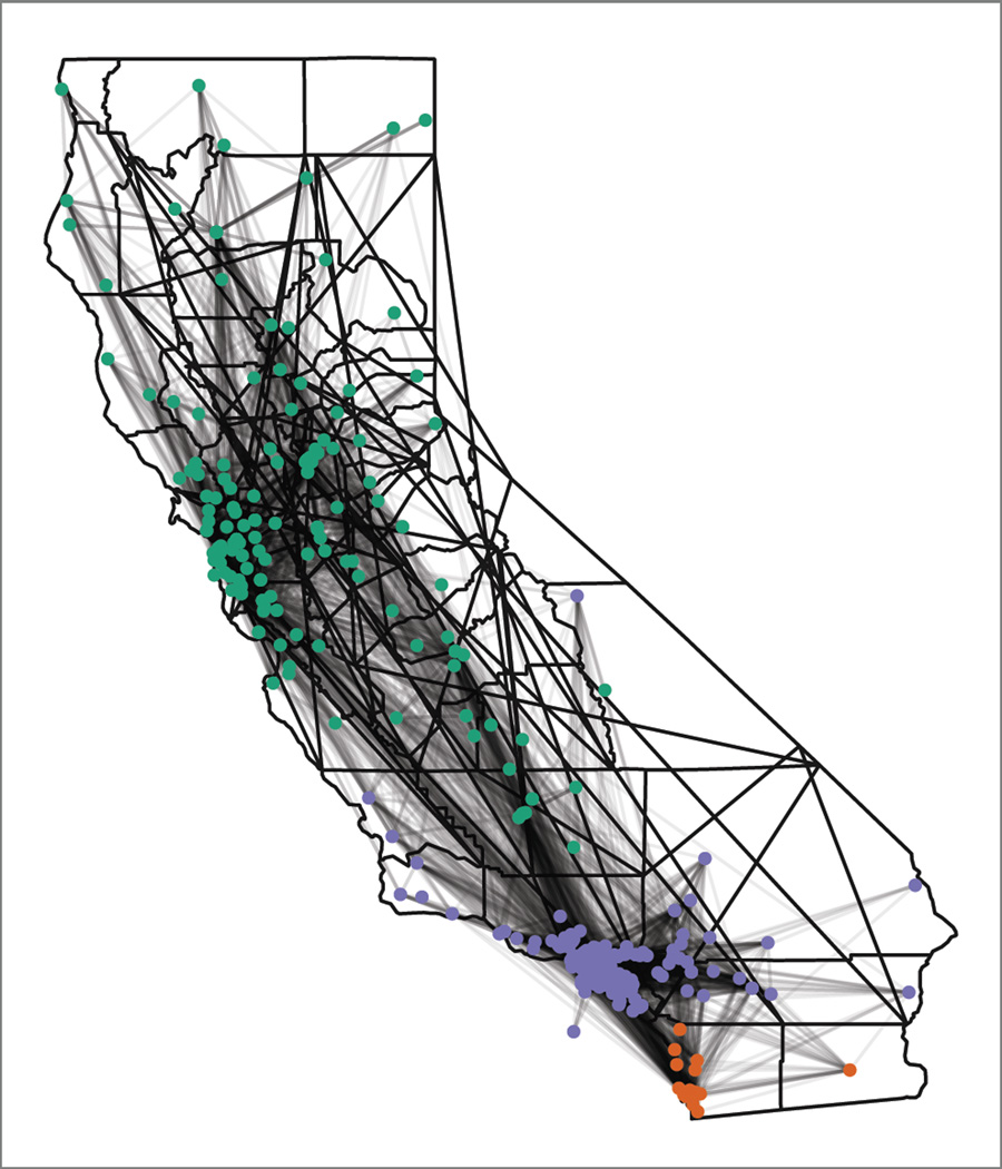
Figure 2.
Map of hospitals (dots) and transfers (dark lines) on a map of CA. The same connections from Figure 1 are projected onto a map of CA. Major clusters are colored separately (San Diego in orange, LA in purple and San Francisco and Northern CA in green), and the map shows how transfers create close connect hospitals, despite geographic distance.

