Figure 3.

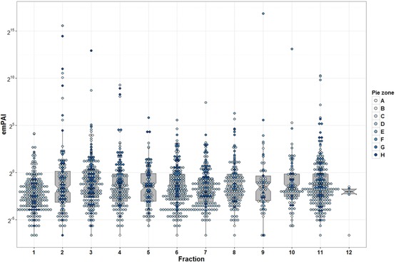
Whisker and box plot overlaid with dot plot showing median and quartile values of the emPAI for ureter proteome database. Dots color represents pie zone location based on Fig. 2A sorting. The y‐axis shows emPAI value in log2 view.

Whisker and box plot overlaid with dot plot showing median and quartile values of the emPAI for ureter proteome database. Dots color represents pie zone location based on Fig. 2A sorting. The y‐axis shows emPAI value in log2 view.