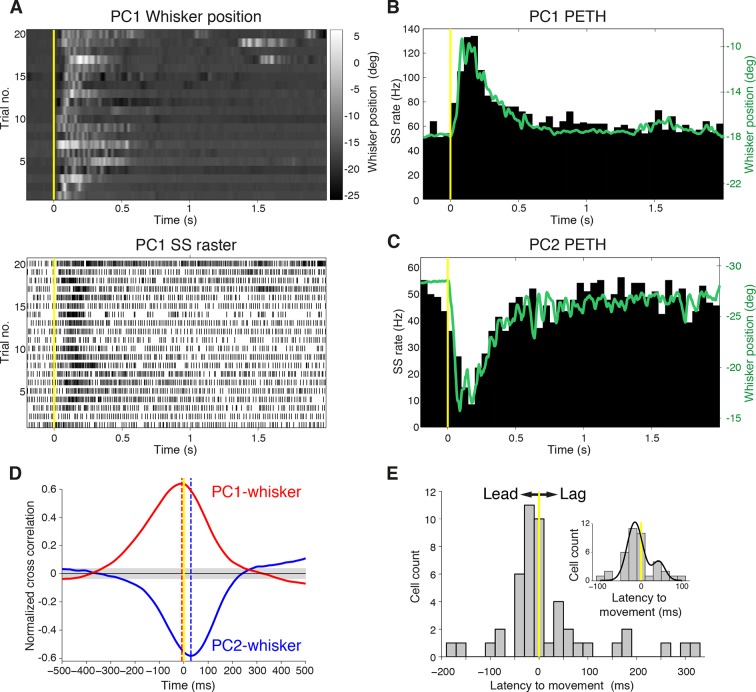
Figure 2. Purkinje cell simple spike discharges reliably track whisker movements.
(A) Whisker movements and corresponding simple spike raster from a single PC across 20 epochs of free whisking. Neuron demonstrates increased SS frequency during movement. (B) Peri-event time histogram (PETH) for the same PC, obtained by averaging SS rate across trials illustrated in (A), overlaid with averaged whisker position (in green). Note the close relationship between SS firing rate change and mean whisker position. (C) PETH for a PC demonstrating reduced SS frequency during movement. The close relationship between SS firing rate change and mean whisker position is preserved. (D) Normalized cross-correlations between whisker position and SS discharge for exemplar PCs. The peak (red for PC1; shown in A, B) or trough (blue for PC2; shown in C) indicates the temporal relationship between whisker position and spiking. PC1 leads whisker movement by 8 ms (difference between red and yellow dashed lines), while PC2 lags movement by 27 ms (difference between blue and yellow dashed lines). Gray shade demonstrates 95% confidence interval. (E) Temporal relationship between whisker movement and SS discharge for all modulated PCs (bin size: 20 ms). More units show lead (negative latency to movement) than lag (positive latency to movement) with respect to behavior. Inset: zoomed-in histogram between -100 ms and 100 ms. Black line is best fit of two summed Gaussians.
Figure 2—figure supplement 1. Complex spike relationship to whisker movement.

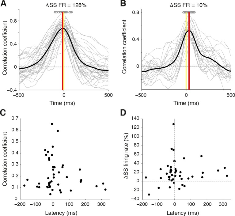
Figure 2—figure supplement 2. Temporal relationship between whisker movement and SS firing rate for strongly and weakly modulated PCs.
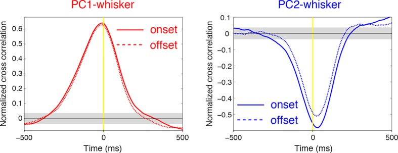
Figure 2—figure supplement 3. Relationship between SS firing rate and whisking offset.


