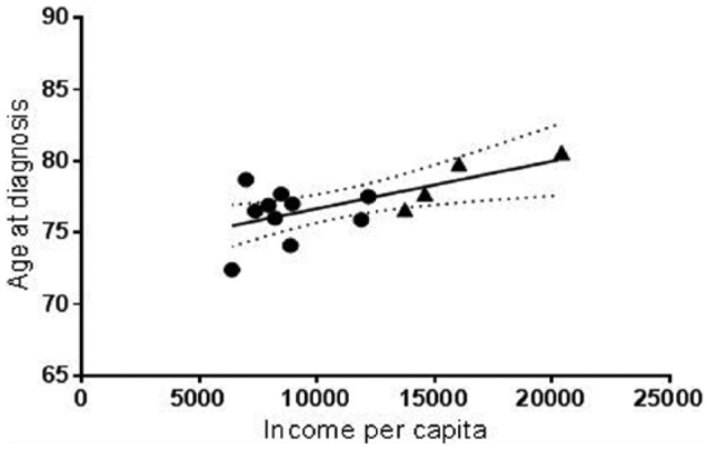
Figure 1.

Pearson’s correlation of age at diagnosis and income per capita. The average age at diagnosis of each municipality in the Metro Region (triangle) and Northwest-Central Region (circle) was plotted against the respective income per capita (r = 0.6496; p < 0.0119). A line that illustrates the best fit was determined using linear regression (R2 = 0.4220).
