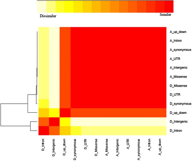
Fig. 2.

Heat map visualizing the degree of similarity between additive and dominance genomic relationship matrices for each genomic region. Very similar matrices are indicated in red and very dissimilar matrices are in white. Variable names that begin with an “A_” denote additive relationships and those with a “D_” denote dominance relationships. “up-down” indicates regions that are located 5 kb upstream and downstream of the gene
