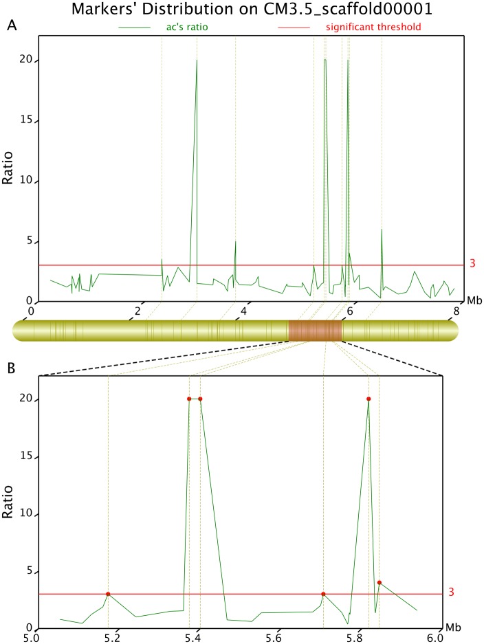
Fig 8. Differential ratio distribution of the sweet trait-related differential markers on CM3.5_scaffold00001 determined using the Geno_ratio.pl software.
The x axis represents chromosomal position. The y axis shows the difference ratio. The upper part of the figure presents the global distribution of the differential markers, while the lower part shows the local distribution. The y axis values at the red lines suggest that the corresponding markers are intensively correlated with target traits. Higher values indicate a more intensive correlation. When Ratio_R°>20, the correlation intensity is 20.

