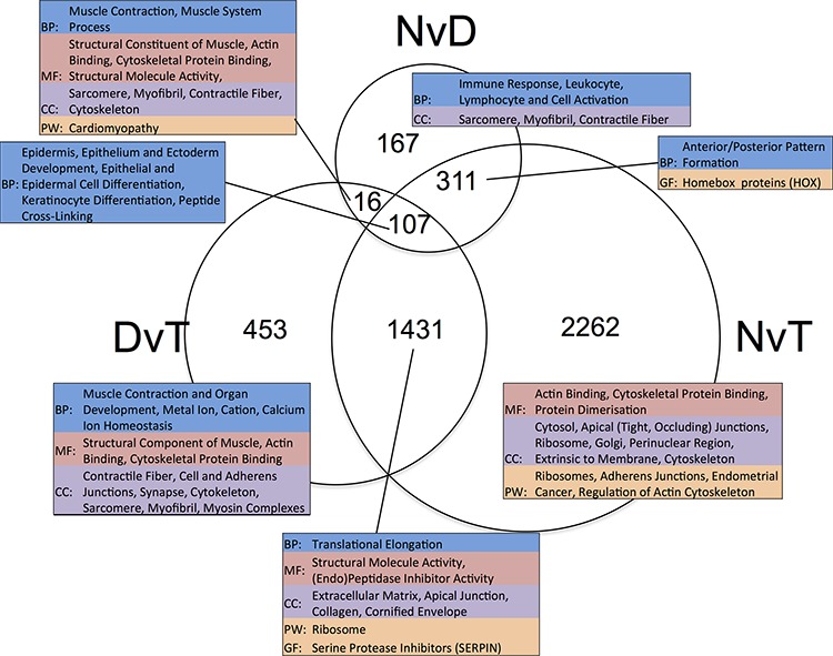
Figure 2. Venn diagram showing the overlap in lists of differentially expressed genes ascertained per pairwise, matched-sample comparison of our dataset.

The numeric labels indicate the number of genes in each set. The tables highlight the significant (p < 0.05) functional enrichment within each subset according to gene ontology terms (BP: Biological Process, CC: Cellular Component and MF: Molecular Function), pathway (PW) analysis using Biocarta, KEGG and Panther, and gene family (GF) enrichment according to Panther. NvD: Normal versus Dysplasia. DvT: Dysplasia versus Tumour. NvT: Normal versus Tumour.
