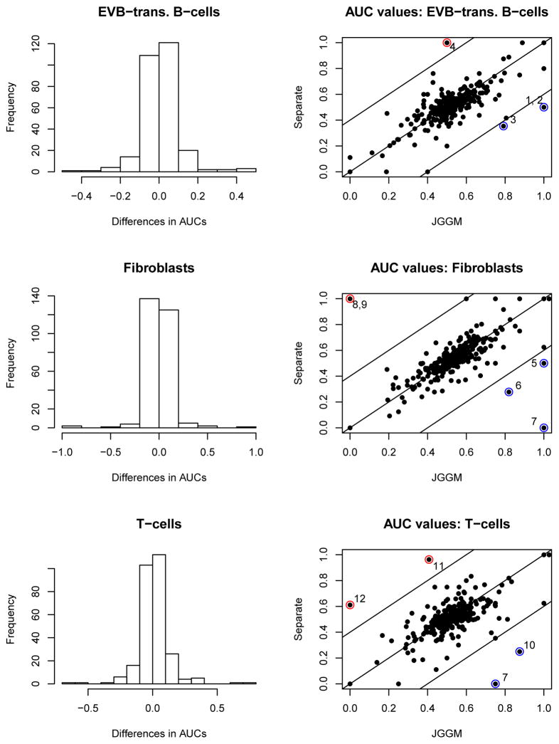
Figure 3.
The histograms of the differences in AUC values (JGGM - Separate) and the scatter plots of the AUC values are presented. 150, 134 and 149 pathways (out of 277) show higher AUC values with the JGGM approach for B-cells, fibroblasts and T-cells, respectively. The pathways with the AUC difference greater than 0.4 are marked and the names are given in Table 2.

