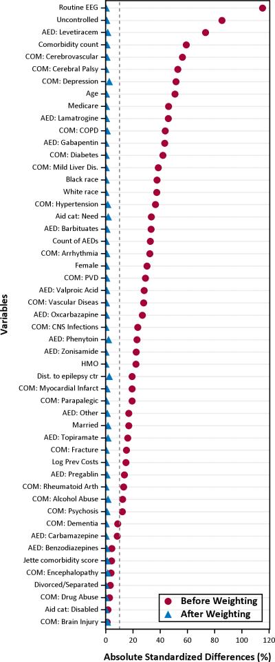
Figure 1. Love plot of absolute standardized differences before and after inverse probability of treatment weighting.
The red dots show the absolute standardize differences of each covariate between the surgery and control groups before weighting (i.e. unadjusted), and the blue triangles are the differences after propensity score inverse probability of treatment weighting. Values within the dotted grey line and the vertical axis represent less a 10% standardized difference between groups and are negligible.

