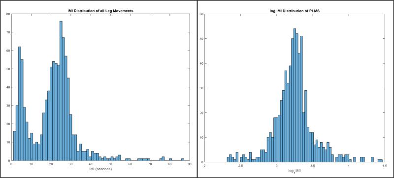
Fig. 1.
IMI distribution from a single patient. On the left side, all IMI are displayed, regardless of whether they take place during a PLMS run. Notice the two distinct peaks, which have been noted elsewhere by Ferri [7] as comprising two distinct lognormal distributions, separated by a dip at 10 s. The graph on the right is, firstly, a distribution of only IMI occurring in runs of PLMS, with a minimum IMI of 10 s, to isolate the second peak. Secondly, it is displayed on a logarithmic scale to better illustrate the near-normal distribution of IMI when expressed logarithmically.

