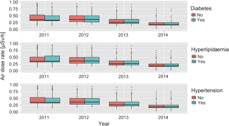
Figure 2.
Box plots for the distribution of radiation levels at non-evacuees’/temporary-evacuees’ residences by disease status. The bar represents the median radiation air dose rate, the box shows the 25th and 75th centiles, whiskers are 1.5 times the IQR, and outliers and extreme outlets are shown by dots and asterisks, respectively.

