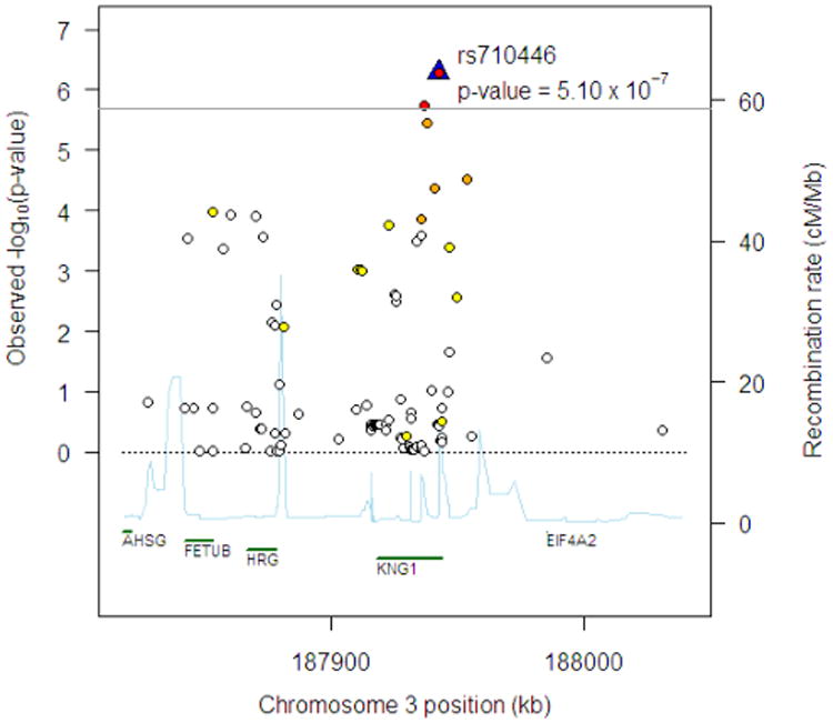
Figure 1.

Regional association plot at chromosome 3q27 region for FVIII:C in EAs. The horizontal line indicates the pre-specified significance threshold of P = 2.0 × 10⁻⁶. The top SNP is shown by the blue triangle and labeled. The colors of the remaining SNPs reflect the r2 with the top SNP based on the HapMap CEU data with the following color scheme: r2≥0.8—red, 0.5≤r2 < 0.8—orange, 0.2≤r2 < 0.5—yellow, r2 < 0.2—white. The light blue line represents the recombination rate (the y axis at right side) based on the data from the HapMap CEU, YRI and JPT1CHB populations. Gene annotations are shown along the x axis.
