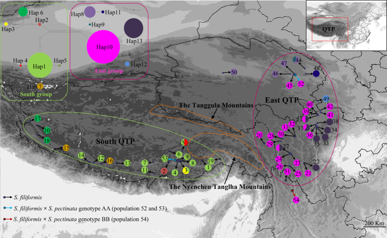
Figure 1. The geographical distribution of S. filiformis populations.
The map is created by DIVA-GIS. Right top is the map of China, indicating the Qinghai-Tibetan Plateau. Sampling locations are marked with population codes. Populations indicated by red and blue arrows are hybrids between S. filiformis and S. pectinata. Pie charts show the proportions of haplotypes within each population. Solid lines encircle SAMOVA-identified groups: green, ‘South group’; and red, ‘East group’. Left top is the network of 13 haplotypes of S. filiformis. The pie size is proportional to the haplotype frequency. Each dot between haplotypes indicates a mutational step.

