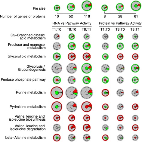
Fig. 5.

The cases where similar trends in the correlations between metabolome-based pathway activity and RNA or protein level were observed. Three pairwise comparisons based on the time points T0, T1, T8 were included, for RNA and protein levels respectively. The radius represents the volume (total number of genes or proteins) of the target pathway. Inner circle represents the metabolome-based pathway activity; gray: no significant difference in pathway activities; red: significantly more active; green: significantly less active. The intermediate ring stands for ratio of up- or down-regulated genes or proteins from the transcriptome or proteome comparison; gray: genes or proteins not significantly differentially expressed; red: up-regulated genes or proteins; green: down-regulated genes or proteins. The outer thin ring stands for the relationship between metabolome-based pathway activity and predicted RNA or protein level pathway activity; red: positive correlation, green: negative correlation
