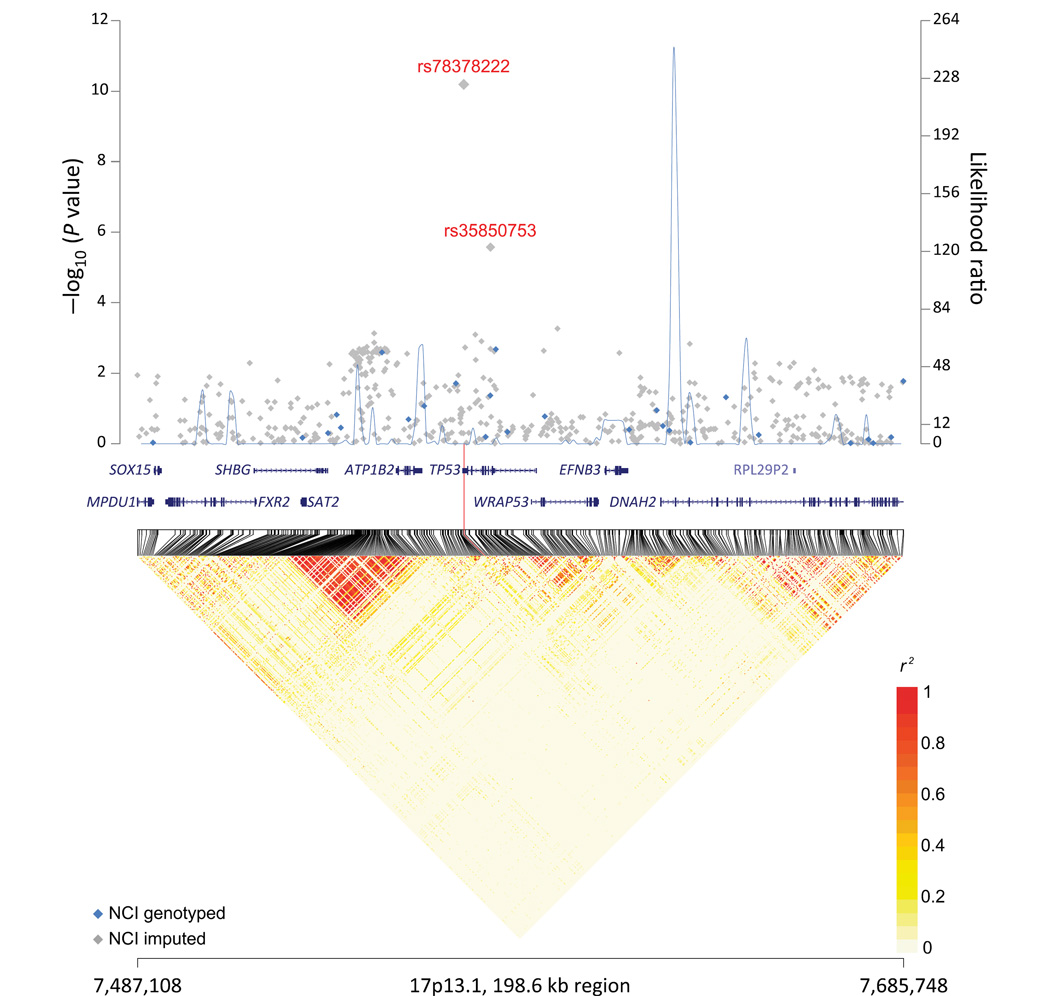
Figure 1.
17p13.1 regional plot. Results of trend test for association for genotyped (blue diamond) and imputed (gray diamond) SNPs were plotted on a negative log scale (left y-axis) against genomic coordinates (x-axis, 17p13.1:7487108–7685748, hg19). Blue line graph depicts recombination hotspots inferred from the 1000 Genomes Project phase 1 European data (100 random sampled) in likelihood ratio statistics (right y-axis). Lower panel depicts linkage disequilibrium heat map based on r2 using the 1000 Genomes Project phase 1 European data (n = 379).

