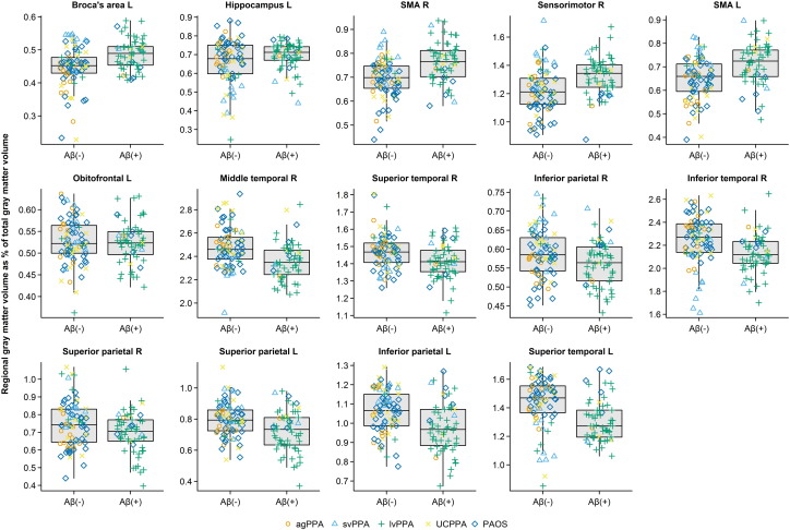
Fig. 3.
Dot plots showing regional gray matter volume expressed as a percentage of total gray matter volume stratified by Aβ status for each of 14 regions included in the optimal penalized logistic regression model. The distributions for all Aβ (−) and Aβ (+) subjects are summarized with standard box plots in the middle of each panel indicating the median, quartiles, and having whiskers extending out to 1.5 times the inter-quartile range. Clinical diagnoses are indicated with different symbols.

