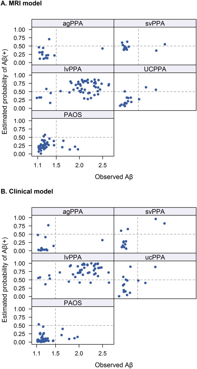
Fig. 6.
Scatter plots showing the estimated probability of Aβ (+) from the optimal penalized logistic regression model (y-axis) versus the observed Aβ value (x-axis) by clinical diagnosis. Panel A shows the results for the MRI model and panel B shows the results for the clinical model. A vertical line at 1.5 defines Aβ status while a horizontal line at 0.50 indicates the cut-point for predicting Aβ (+). Subjects in the top right or lower left quadrants are correctly classified by the model.

