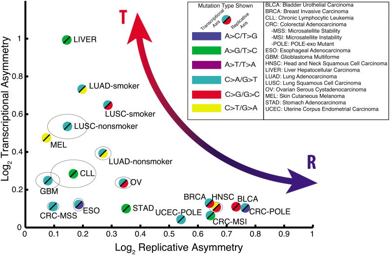
Figure 3. Cancer cohorts vary widely across the asymmetry map.
For each cohort listed, the maximal replicative asymmetry (x-axis) and the maximal transcriptional asymmetry (y-axis) were measured and plotted. Grey ellipses denote 95% confidence intervals for cohorts in which these extend beyond the bounds of the plot symbols.

