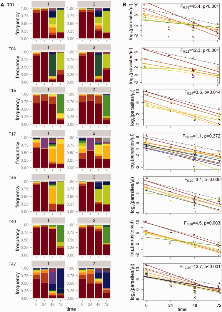
Figure 4.
Estimating subpopulation clearance curves from infections in Tanzania. (A) Relative abundance of different parasite subpopulations (defined by haplotypes) within patients. For each patient (row), there are two bar graphs representing technical replicates, labeled 1 and 2. Within each patient, individual subpopulations have specific colors and are ranked by initial frequency. (The same color may thus represent different haplotypes in different patients.) (B) Densities of individual subpopulations (points) are calculated as the total density by quantitative PCR (crosses) multiplied by their relative abundance. Clearance curves are plotted for the total parasite density (dashed lines) and individual subpopulations (colored lines). Statistics reported represent model comparisons; P values < 0.05 indicate that a more complicated model that includes different slopes for each subpopulation within a patient explains significantly more variation than a model with a single slope. Similar plots for 12 additional patients for whom parasites could not be detected at 72 h by PCR can be found in the Supplementary Figs S2 and S3

