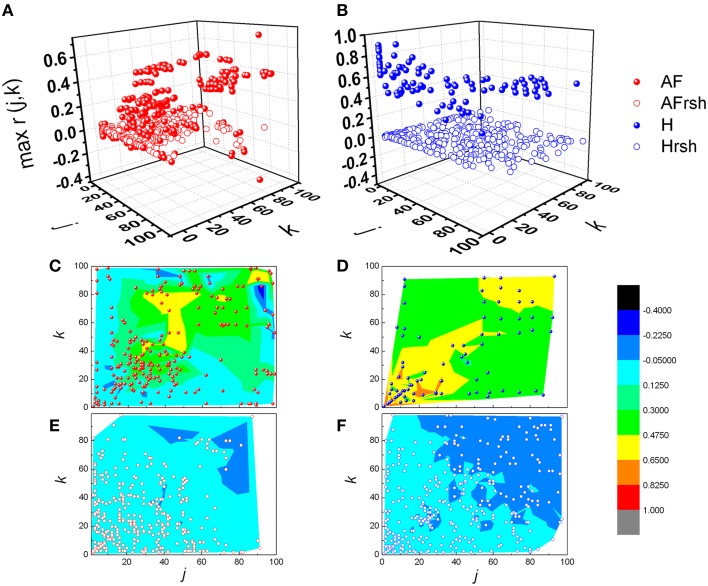
Figure 6.
Distribution of pooled local maxima of Pearson's correlation coefficient matrices – max r(j,k) in patients with atrial fibrillation (A) and healthy subjects (B) and their corresponding reshuffled data. AF, AF patients; AFrsh, AF reshuffled; H, healthy; Hrsh, H reshuffled. Contour plots are given with corresponding maxima points for patients with AF (C) and their reshuffled data (E), and healthy subjects (D) and their reshuffled data (F). Contour plots are surface graphs of (j,k, max r(j,k)) data where ranges of max r(j,k) values are distinguished by different colors.

