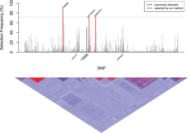
Fig. 2.
Manhattarn Plot for Selection Frequency (%); dashed horizontal line: estimated threshold ; vertical blue lines: selection frequencies of the four previously-detected SNPs that are associated with overall survival of CM patients by Yin et al. (2015); red vertical lines: the SNPs whose selection frequencies pass the estimated threshold; the lower panel: pairwise correlations across the 2339 SNPs with the strength of the correlation, from positive to negative, indicated by the color spectrum from red to dark blue

