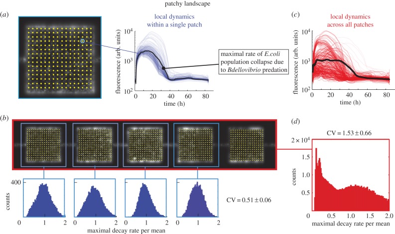
Figure 2.
Predation rates in a patchy landscape. (a) Yellow dots indicate 98×98 points (for clarity, only 16×16 are shown) that were used to generate time traces (thin blue lines show single time traces for one patch, the fat black line represents the mean) from patches of the fragmented landscape. The maximum predation rate is extracted from individual traces. (b) Distribution of the maximal rate of decay of four patches. (c) All time traces of all patches within a patchy habitat (thin red lines show single time traces for one patch, the fat black line represents the mean). (d) The distributions of the maximum decay rates calculated for all points in all patches within the patchy landscape.

