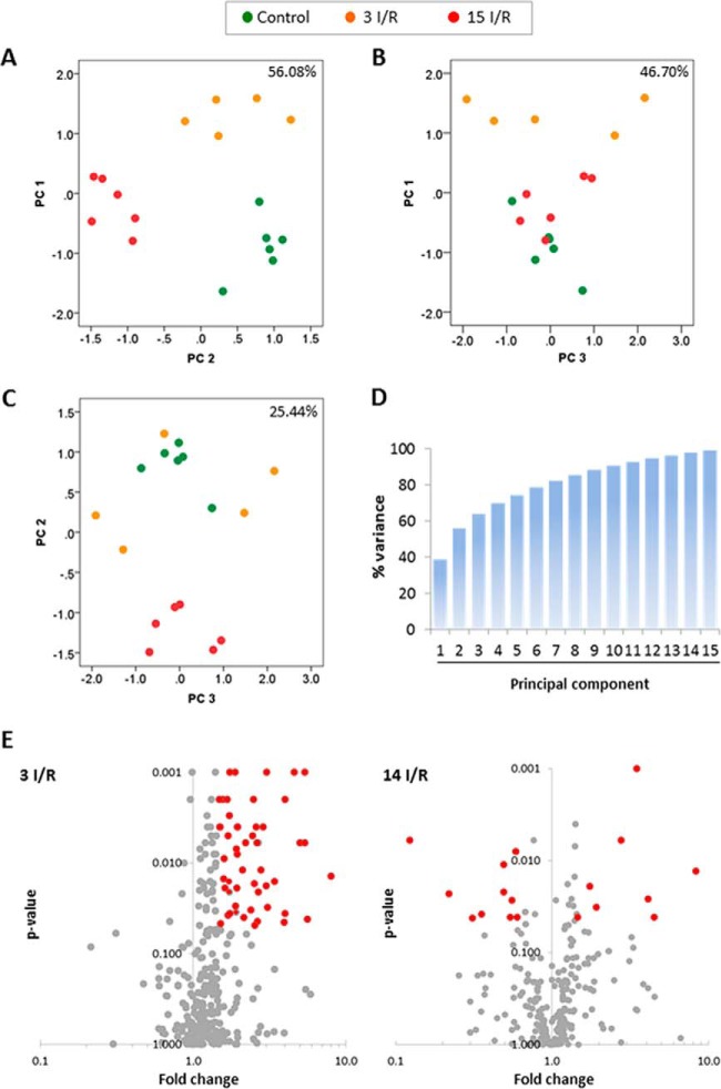
Fig. 2.
Principal component analysis and volcano plots. The graphs represent the percentage of variability explained by the PC1 against PC2 (A), the PC1 against PC3 (B), and the PC2 against PC3 (C). The analysis is based on the differentially expressed proteins identified. Data points represent individual biological replicates (control, n = 6; 3 I/R, n = 5; 15 I/R, n = 6). D, cumulative variance graph for all principal components. E, volcano plots 3 (3 I/R) and 15 days (15 I/R) after I/R. The normalized peptide counts of each mitochondrial protein in the 3 I/R and 15 I/R groups were compared against controls. Each point represents an individual protein. The significant differences (p < 0.05 and fold change ≥1.5 or ≤0.5) are indicated in red.

