
Fig 2. Performance curves for the best performing (MKL-Gaussian) model.
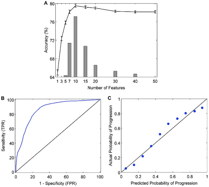
A: The learning curve shows validation accuracy as a function of the number of features in the model (line graph with 95% confidence intervals). Juxtaposed is a histogram showing the frequency with which a given number of features was identified as the optimal (most accurate) number of features across 100 trials of the 10x10 cross-validation experiment (median = 10 ± 3). B: Receiver operating characteristic curve (blue line; AUC = 0.87), showing the trade-off between sensitivity (true positive rate, TPR) and 1 –specificity (false positive rate, FPR). The area under the curve (AUC) measures how well the model discriminates between N-MCI and P-MCI patients. The black diagonal line represents random classifier performance (AUC = 0.5). C: Calibration curve, indicating the degree to which the model's predicted probabilities (risk) of MCI-to-dementia progression agree with the actual probabilities of progression. With a perfectly calibrated model, we expect complete agreement between predicted and actual probabilities (diagonal line).