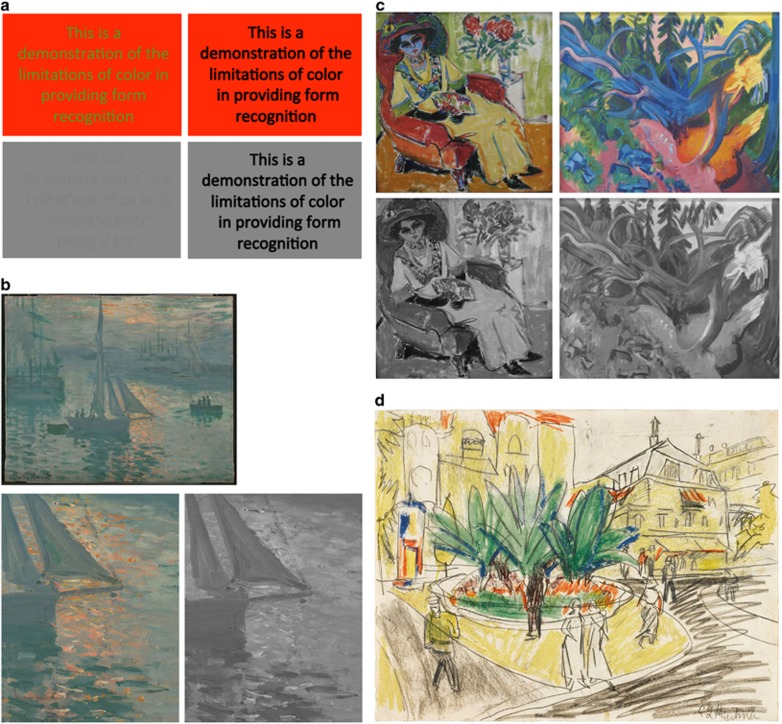
Figure 7.
Color vs form. (a) Equiluminance. Green-on-red lettering is hard to read when the colors have equal brightness. The grey scale version shows how the lettering disappears. (b) Claude Monet (1840–1926): Sunrise (Marine) (1873). The water glistens in the red sun, because of equiluminance of the reflections and water. The grey scale detail shows how the red disappears. (c) Ernst Ludwig Kirchner (1880–1938): Seated Woman (Dodo) (1907) and Uprooted Tree (1922). Both of these paintings use unusual colors but the grey scale views show why only the woman looks realistic: the brightness cues in the forest are quite obscure. (d) Kirchner, The Trees in the Albertplatz in Dresden (1910–1911). This drawing shows a lovely group of trees in a square, surrounded by buildings with yellow facades. We are hardly concerned by the location the color fields because we recognize the objects by their black outlines. Image details: (a) © M F Marmor. (b) Oil on canvas (50 x 61 cm). Google Art Project: J Paul Getty Museum, Los Angeles, CA, USA. (c) Oil on canvas (112x114 cm). Seated Woman: Wikimedia Commons and Foundation (photograph Rufus 46): Pinothek der Moderne, Munich Germany; oil on canvas (100 × 120 cm). Uprooted Tree: Wikimedia (photograph Hajotthu): Sprengel Museum, Hanover, Germany. (d) Crayon and pencil on paper (27 × 35 cm). Wikimedia (photograph Sotheby's): sold by Sotheby's in 2012.

