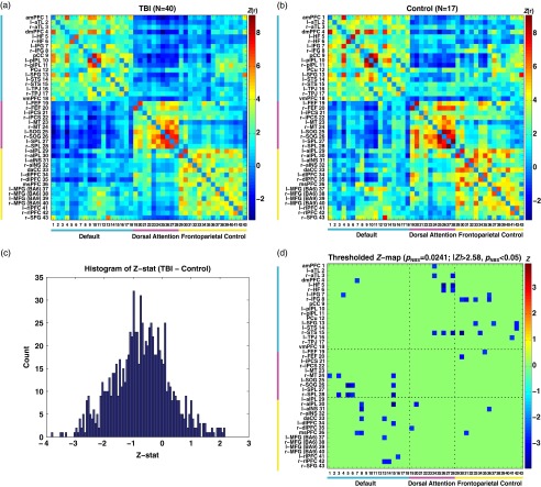
Fig. 1.
Group comparisons of average connectivity matrices. (a) Average connectivity of the TBI group. (b) Average connectivity of the control group. (c) Histogram for Z-statistics of group comparisons on average connectivity. (d) Thresholded Z-statistic map for group comparisons (p NBS<.05 at |Z|>2.58). Colorbars in (a) and (b) represent Fisher’s Z-transformed correlation coefficients. See Table 2 for abbreviations for the name of regions.

