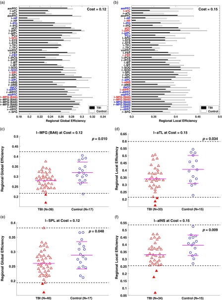
Fig. 5.
Regional, global, and efficiency of the TBI group and the controls at network costs of 0.12 and 0.15, respectively. (a,b) Bar graphs for average regional global and local efficiency, respectively. Red and blue colors represent brain regions with p<.05 and p<.1, respectively. (c,e) Scatter plots for regional global efficiency of the selected regions. (d,f) Scatter plots for regional local efficiency of the selected regions. See Table 2 for abbreviations and Figure 4 for the details of the scatter plots.

