
Figure 5. A principal component analysis biplot diagram showing similarity relationships among 2,343 relative abundance profiles for the 22 OTUs.
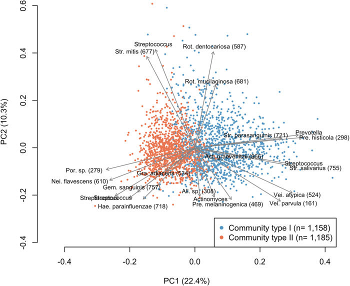
The relative abundance profiles belonging to each community type are depicted using different colors. The direction and length of the arrows indicate how each OTU contributes to the first two components in the biplot. These two components explained 22.4% and 10.3% of the variance, respectively.