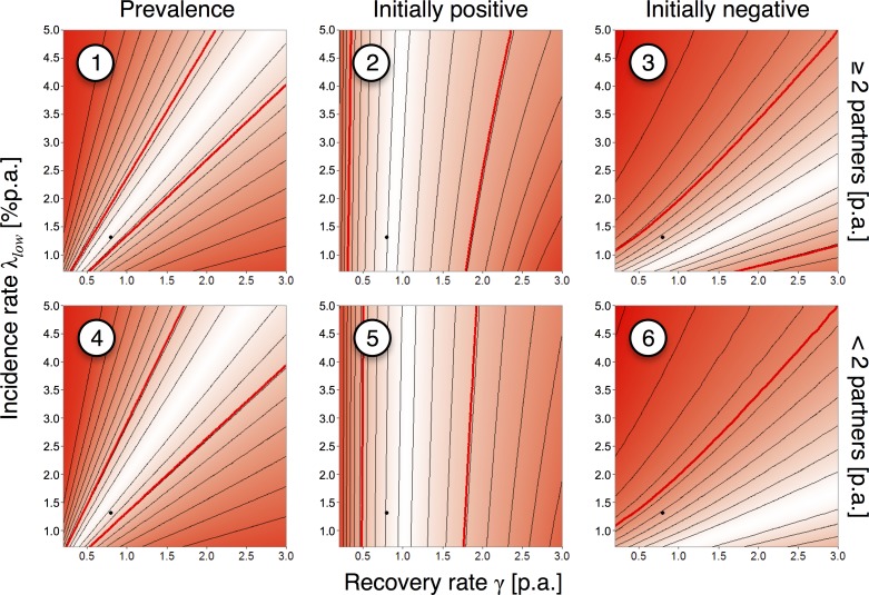
Fig 4. Likelihood landscapes by data item, London students.
Upper and lower rows of the panels correspond, respectively, to the high-risk group (≥2 partners in the preceding year at baseline) and low-risk group (<2 partners); columns of the panels correspond to the prevalence at baseline, the proportion of positive tests at follow-up among the initially M. genitalium-positive participants, and the proportion of positive test at follow-up among the initially negative participants. Numbering corresponds to Fig 1A; black dots: overall maximum-likelihood estimate (MLE) for the recovery (γ = 0.80p.a.) and the incidence rates (λlow = 1.31%p.a.); the ratio λhigh/λlow was fixed at the MLE of 3.0; thin, black contours: equal likelihood; colored areas: white indicates maximum likelihood, red indicates low likelihood; thick, red contours: parameter area where the model is consistent with the empirical data (α<0.05).

