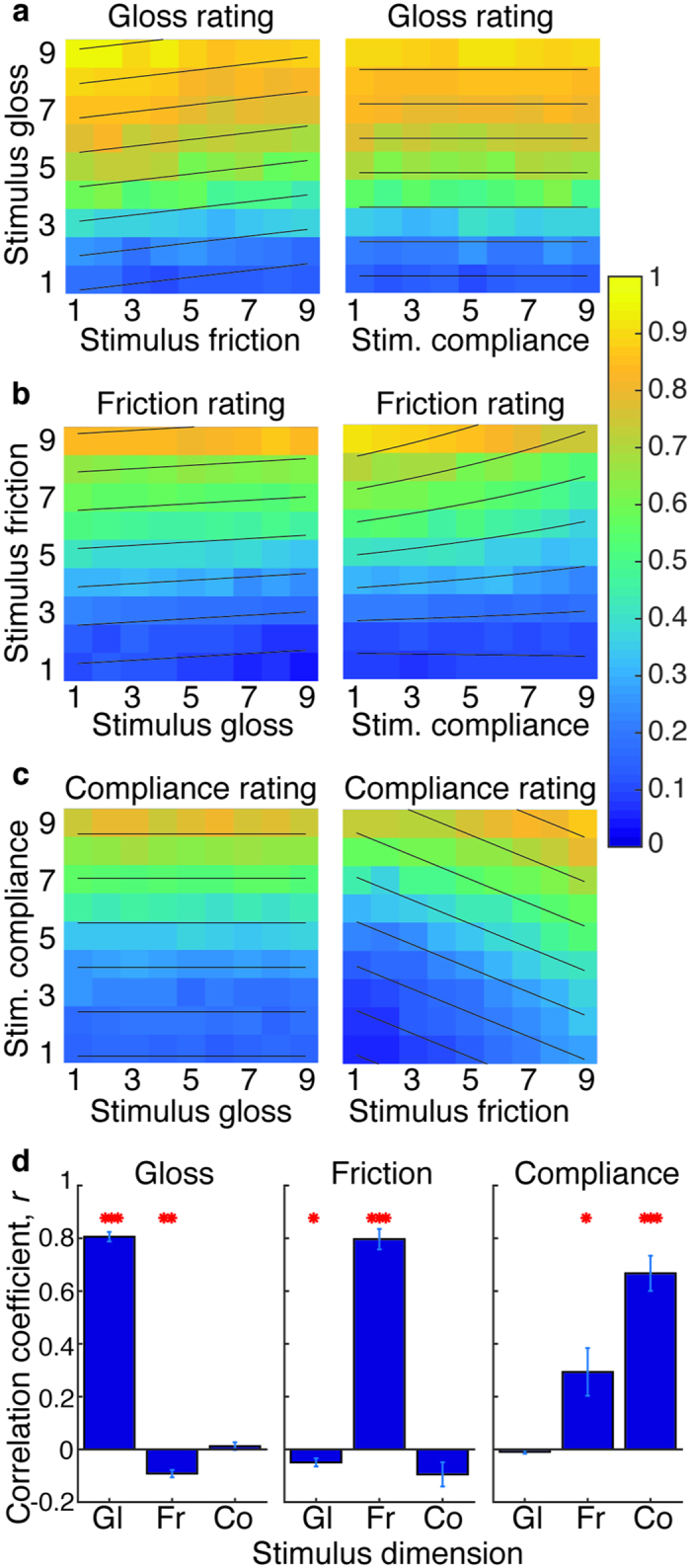
Figure 3.

Stimulus ratings, averaged across observers, for (a) perceived gloss, (b) perceived friction and (c) perceived compliance. Yellow indicates high ratings; blue indicates low ratings, as indicated by the legend. Dashed contour lines show stimulus parameter pairings that produce equal ratings, as determined by the optimal regression models. (d) Mean correlation between each stimulus parameter (gloss: ‘Gl’, friction: ‘Fr’ and compliance ‘Co’) and each of the three rating scales (each rating type shown in a separate plot). Error bars give ± 1SE across observers. Asterisks show significant correlations, from one-sample t-tests against 0 (*p < 0.05, **p < 0.01, ***p < 0.001).
