Fig. 3.

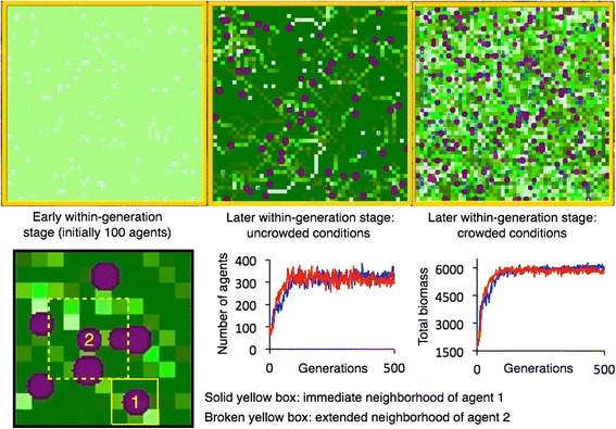
Various stages of the within-generation simulation (top three panels) show agent location and biomass state (blue-to-purple circles, size an indication of relative biomass) and within cell resource levels (light to dark green indicating low to high resource levels). Solid yellow rectangle contains the eight nearest-neighbors around agent 1’s current location); broken yellow rectangle contains the eight nearest-neighbors and 16 next-to-nearest neighbors around agent 2’s location. Individuals choose mates from across the whole landscape and not just local neighborhoods. Red and blue graphs in middle and right bottom panels show the result from two repeated runs of the number of agents each generation and the total final biomass of these agents and the end of each generation over a 500-generation evolutionary simulation
