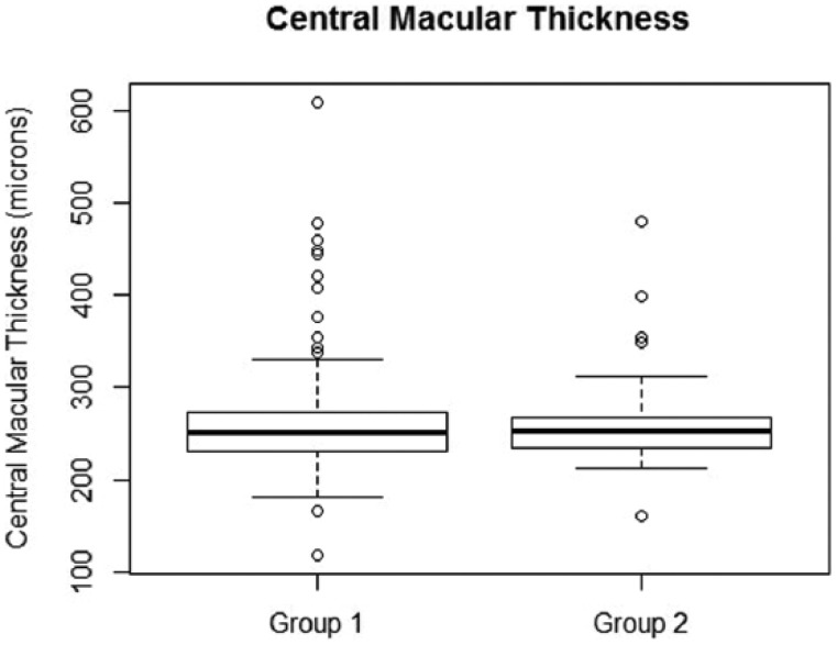
Figure 5.
Box plot showing the distribution of CMT values in Group 1 and Group 2. Median value for corresponding group is represented by the bold line inside each box. The 75th percentile is represented by the upper boundary of the box plot. The 25th percentile is represented by the bottom boundary of the box plot. Empty circles are outliers. Mann–Whitney test was used to compare CMT distribution in Groups 1 and 2. The resulting P value is .9. This means that distribution in Group 1 is not different from distribution in Group 2.

