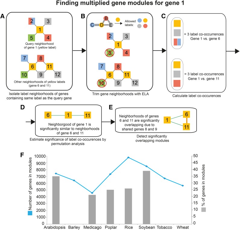
Figure 2.
Detecting similar modules. The pipeline is exemplified by searching for similar modules to the neighborhood of gene 1. A, The neighborhood of the query gene 1 is first isolated. Nodes represent genes, edges represent coexpression relationships, and node colors indicate labels found in collected genes. Note that gene 2 has two labels, red and blue. Label neighborhoods of genes containing orange label (genes 6 and 11) are isolated. B, The neighborhoods are trimmed with ELA, where labels not supported by ELA are removed (Fig. 1D). C, Label co-occurrences found between the neighborhood of the query gene and label neighborhoods are calculated. As gene 2 contains two labels, genes 7 and 8 are collapsed into one label co-occurrence. D, The significance of found label co-occurrences is estimated by permutation analysis. Green edges indicate similar neighborhoods. E, Overlapping modules are identified. F, Total numbers and percentages of genes assigned to similar modules. The blue line (left y axis) denotes the numbers of genes assigned to modules. Gray bars (right y axis) represent the percentages of total genes found on the microarrays that are assigned to modules. Note that the percentages of genes for barley, wheat, and tobacco are missing due to the lack of comprehensive genome annotation of the microarrays.

