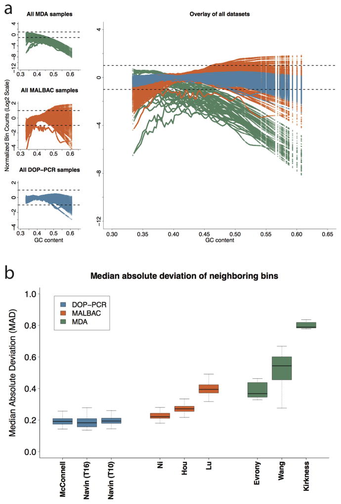
Figure 2.
(a) Lowess fit of GC content with respect to log normalized bin counts for all samples in each of the 9 datasets analyzed: 3 for MDA (top left – green), 3 for MALBAC (center left – orange), and 3 for DOP-PCR (bottom left – blue). Each colored line within a plot corresponds to the lowess fit of a single sample. The dashed lines show a two fold increase or decrease in average observed coverage. Note that the three MDA datasets (top left) have a different y-axis scale due to the large GC biases present. (b) The median absolute deviation (MAD) of neighboring bins: A single pair-wise MAD value is generated for each sample in a given dataset and represented by a box and whisker plot. The bold center line represents the mean, the box boundaries represent the quartiles, and the whiskers represent the remaining data points. The high biases present in the MDA datasets make comparing DOP-PCR and MABLAC samples difficult. Figure 3 of the Online Methods shows this comparison more clearly.

