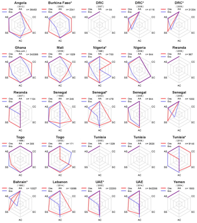
Figure 2.

Radar charts showing differences between observed (in red) and expected (in blue) genotype counts in newborn screening surveys of HbS and HbC in Africa and the Middle East. Surveys for which only data on HbS were presented are not shown. To maximise the visualisation of the differences, each axis is scaled based on the maximum of the observed or expected counts for each survey independently. n = number of newborns tested. A * indicates a population sample for which deviation from Hardy-Weinberg Equilibrium was found to be statistically significant using the likelihood ratio full-enumeration exact test.
