
Figure 5. Comparison of CD8+ T memory phenotypes in paired biopsies from patients with a response to anti–PD-1 therapy.
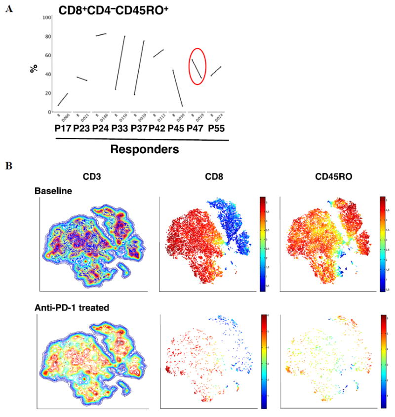
(A) Paired longitudinal analysis of the frequency of CD8+CD4−CD45RO+ at baseline and on anti–PD-1 treatment by exhaustive expansion software. PXX = patient number. B = baseline. DXXX = day of blood draw from the start of anti–PD-1 treatment. n= 9 patients. (B) Visualization of the CD45RO T cells from the suprarenal biopsy from patient #47 nineteen days on therapy. Contour plots of the viSNE maps for double positive for CD3 and live gated cells (excluding CD16 and CD19). The contour plots show cell density in each region of the map. Each dot in the viSNE map depicts the location of an individual cell and its color represents the expression of its immune cell marker. CD3+ T cells (left column) contours plots before (blue), and on anti–PD-1 blockade therapy (red). The expression of CD8+ T (in red) and CD4+ T (in blue) cells inside the CD3 T cell contour plot are shown in the middle column. On the right column, CD45RO (in red) is shown. Red color means high, orange means medium and blue represents low expression of the marker on the cell surface.