
Fig. 1.
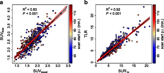
a Correlation between SUVliver and SUVblood. b Correlation between TLR and SURtc. Black lines represent the least squares straight line fits to the data. Red lines depict the 95 % CI
Official websites use .gov
A
.gov website belongs to an official
government organization in the United States.
Secure .gov websites use HTTPS
A lock (
) or https:// means you've safely
connected to the .gov website. Share sensitive
information only on official, secure websites.
a Correlation between SUVliver and SUVblood. b Correlation between TLR and SURtc. Black lines represent the least squares straight line fits to the data. Red lines depict the 95 % CI