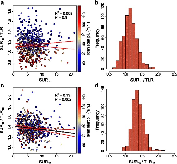
Fig. 3.

a Correlation between the SURtc/TLR ratio and SURtc. b Corresponding frequency distribution. c Correlation between the SURtc/TLRtc ratio and SURtc. d Corresponding frequency distribution. Black lines represent the least squares straight line fits to the data. Red lines depict the 95 % CI
