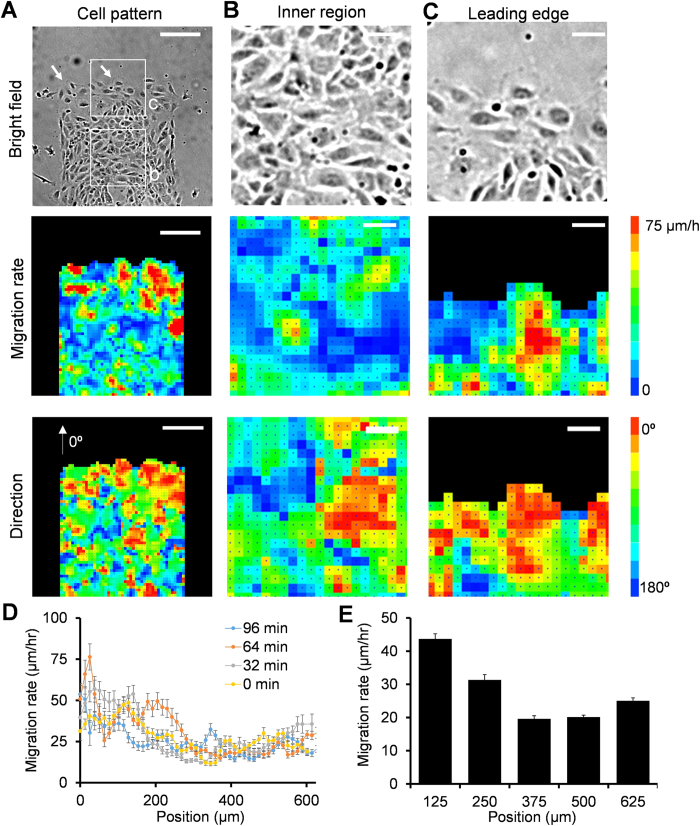
Figure 3. Velocity mapping reveals the formation of migrating clusters with coherent velocities.
(A–C) Representative images (top) and PIV analysis (middle and bottom) of cell migration in a rectangular pattern. White arrow heads indicate the locations of leader cells. White squares indicate the zoom-in regions in (B,C). Scale bars, (A) 200 μm and (B,C) 50 μm. (D) Instantaneous velocity distribution at different time points. (E) Average velocity distribution at different positions from the leading edge. Data represent mean ± s.e.m of over 100 time points. Experiments were repeated three times independently.

