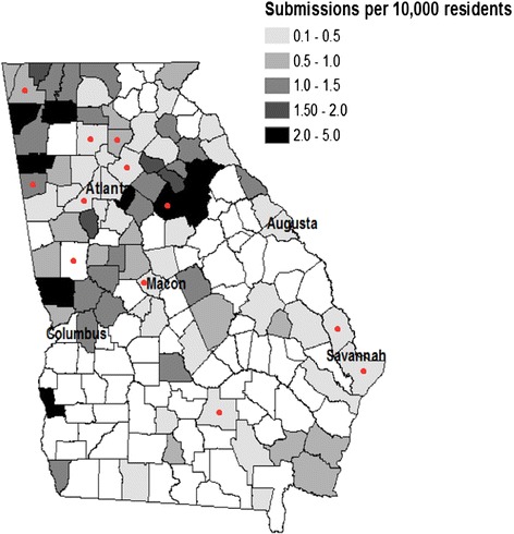
Fig. 1.

Georgia state map of total submissions per 10,000 residents by county. Note that map denotes participants’ resident county, not necessarily where the tick was acquired. Red dots indicate counties where ticks were acquired (not necessarily individual’s county of residence) that resulted in an illness that fit criteria for a potential tick-borne disease
