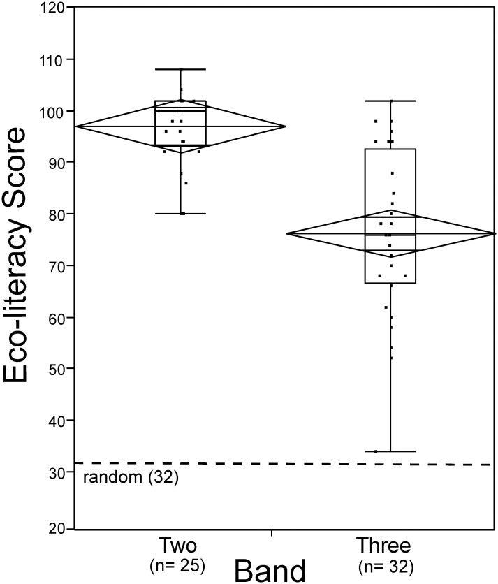
Fig 1. Box plots show scores for Band Two and Band Three respondents.
Each box represents the middle 50% of the data set. The vertical lines show the range of the upper and lower quartiles. The median, or 50th percentile, is represented by the horizontal line within each box. The upper and lower edges of the box indicate the 75th and 25th percentile. The diamonds represent the 95% confidence interval. The dots represent actual score values of individual survey respondents.

